Brief: This project involved creating a custom typeface inspired by Professor Michael O. Snyder, a well-traveled photographer and former geologist with a love for vintage cameras and old maps. The objective was to combine these elements into a cohesive typeface that reflected his personality and professional interests, drawing inspiration from the design of old Kodak Brownie cameras and vintage map typography.
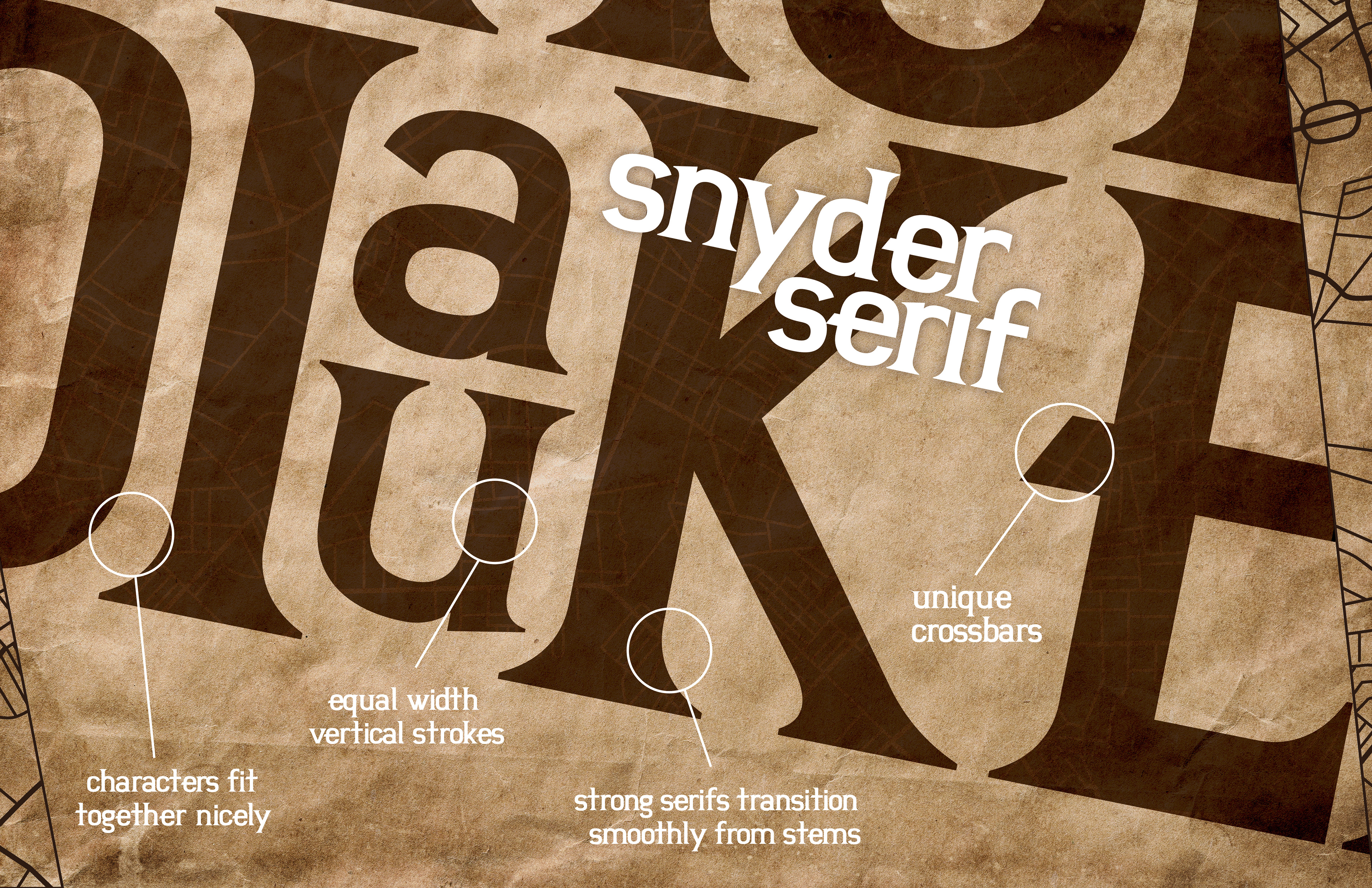
Solve: The typeface, Snyder Serif, was designed with a balance of grounded, classic serif elements and modern touches that reflect Snyder's curiosity and passion for photography. Subtle angles and unique crossbars were incorporated into the characters to symbolize his enthusiasm for learning and exploration, while the serif structure was intended to convey a sense of stability and wisdom. The result was a typeface that personified Snyder’s character while evoking the nostalgia of his favorite design elements.