


Industry
Roles

Concept
The Institute of Parks Protection visualizes the data surrounding our parks. While the National Park Service preserves the physical land, the Institute translates its environmental and infrastructural data. The identity transforms dense research into accessible storytelling, giving visitors the objective context needed to understand their impact on America's protected spaces.
(Ansel Adams, National Archives)

Three 1936 windshield stickers drawn by J.J. Black. (NPS History Collection, HFCA 1606)

The primary mark draws from a specific piece of utilitarian park ephemera: the octagon windshield entry stickers issued in the 1920s and 30s. This octagon container functions not just as a frame, but as a foundational geometric rule dictating the brand architecture. This structure extends directly into the custom wayfinding & typography, where the geometry of the octagon is integrated directly into the stems of the letters themselves.
(NPS History Collection, HPC-00087)


The brand’s visual language stems directly from the NPS archives. Decades of foundational conservation research and internal NPS communications were authored on typewriters. To reflect this utilitarian heritage, the identity relies on a strict monospaced typographic system. This prioritizes objective clarity and anchors the Institute in pre-1980s historical documentation.

Exhibit Design
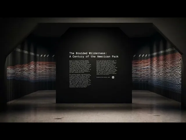
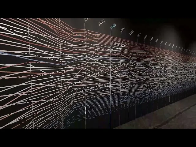
"The Braided Wilderness" is a large-scale data exhibition mapping 120 years of National Park visitation to track our evolving relationship with the outdoors. To ensure absolute statistical accuracy, the underlying 70-park dataset was parsed, cleaned, and structured using custom R scripts. Once the numerical framework was established, the physical exhibition space was designed and rendered entirely within Unreal Engine.
Sound up for the video!


Container System
Translating the octagonal geometry of early park windshield stickers into a functional framing device, the container system acts as a literal window directly into the protected landscapes.


